50 Describe Image Examples with Answers - PTE
The Describe Image question type on the Pearson Test of English is perhaps the most difficult question on the whole test. In this article, you can see 50 example images as well as high-scoring responses for each so that you can thoroughly prepare for this question type.
Sample Questions with Answers for Describe Image questions
Example 1
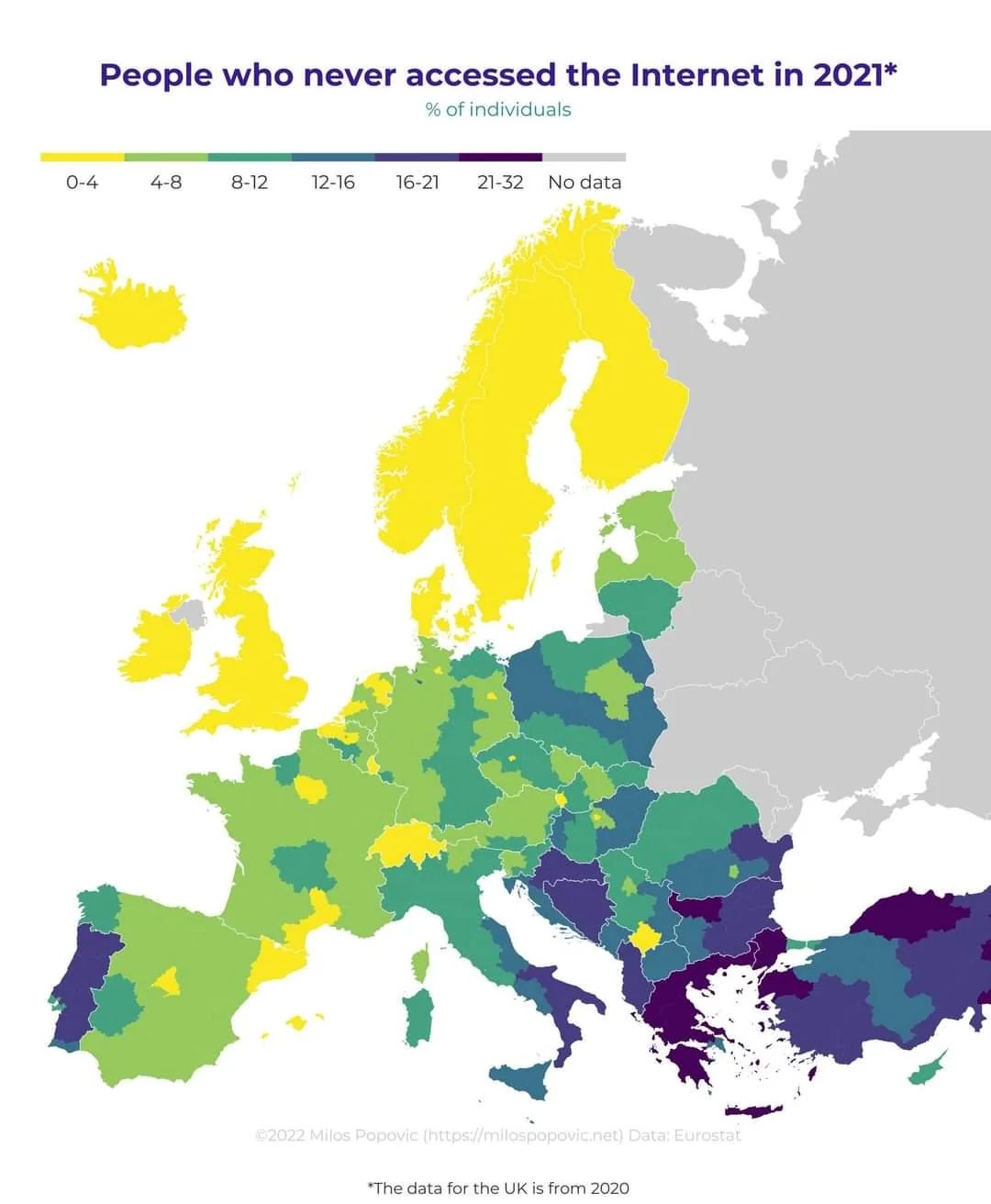
Source: Our World in Data
Answer
This map illustrates the percentage of individuals who never accessed the internet in 2021 across Europe, based on data from Eurostat. The UK data is from 2020. Colors indicate the percentage of non-internet users: yellow regions (0-4%), light green (4-8%), green (8-12%), dark green (12-16%), teal (16-21%), and purple (21-32%). Countries like Norway, Switzerland, and the Netherlands show the lowest percentages, while higher non-usage rates appear in parts of Eastern Europe and the Balkans. Several countries lack data, depicted in gray.
Example 2
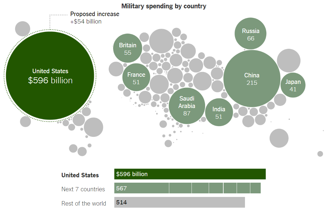
Source: New York Times
Answer
This infographic details military spending by various countries, using different-sized circles to visually represent each country's military expenditure. The United States leads with $596 billion, significantly more than any other nation, and is considering a proposed increase of $54 billion. The next seven countries combined (including China with $215 billion, Saudi Arabia with $87 billion, Russia with $66 billion, Britain with $55 billion, India and France each with $51 billion, and Japan with $41 billion) spend $567 billion, nearly matching the U.S. total. All other countries combined spend $514 billion.
Example 3
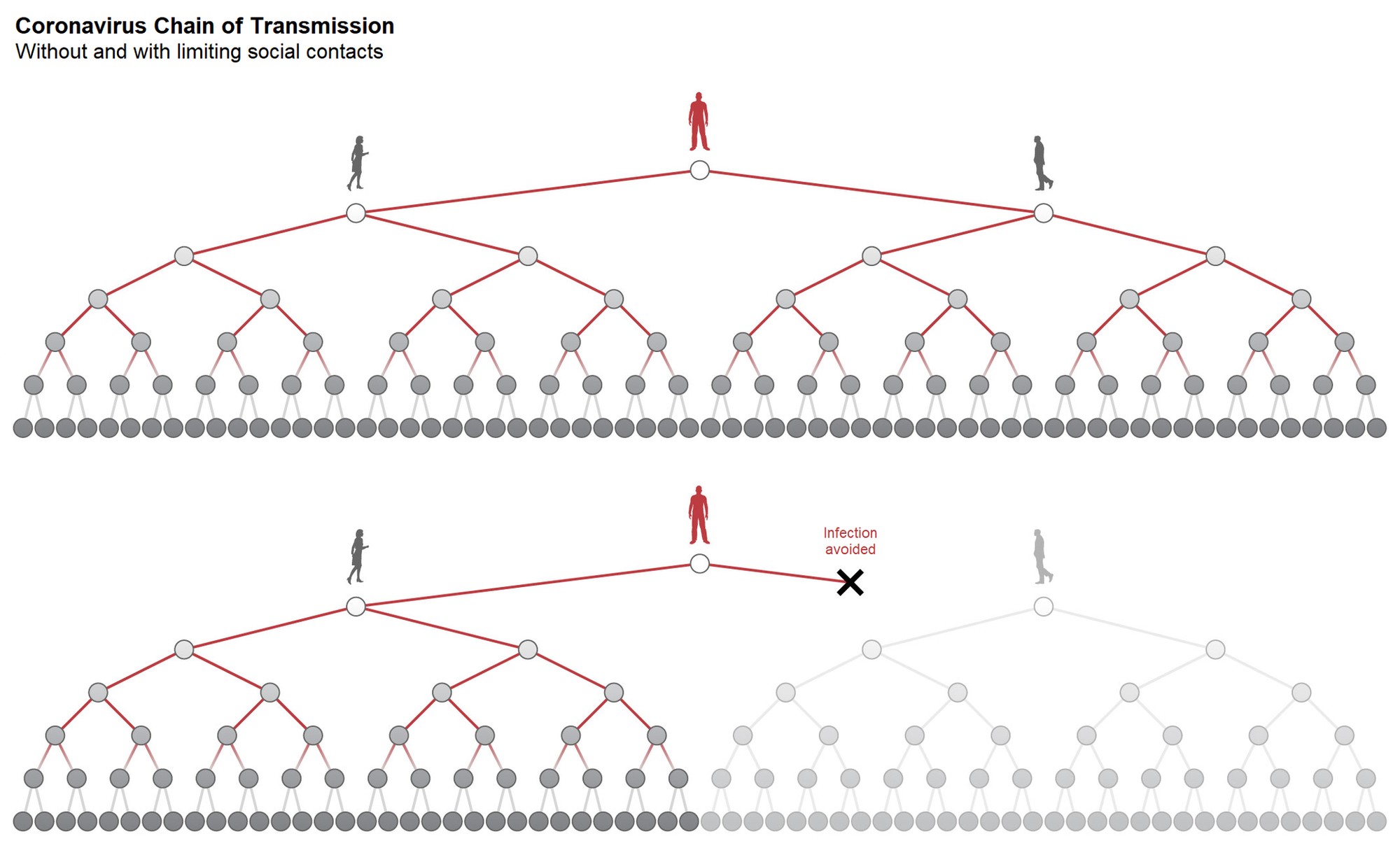
Source: New York Times
Answer
The image illustrates the impact of limiting social contacts on the transmission of the coronavirus. The top half shows a scenario without restrictions, where one infected individual leads to a wide and expanding chain of transmission, infecting numerous others. The bottom half demonstrates a scenario with limited social contacts, significantly reducing the spread of the virus. Key points are highlighted where potential transmissions are avoided due to these measures, visibly showing fewer infected individuals. This visual emphasizes the effectiveness of social distancing in controlling the spread of the virus.
Example 4
Projected career earnings for college graduates in...(USA, 2016)
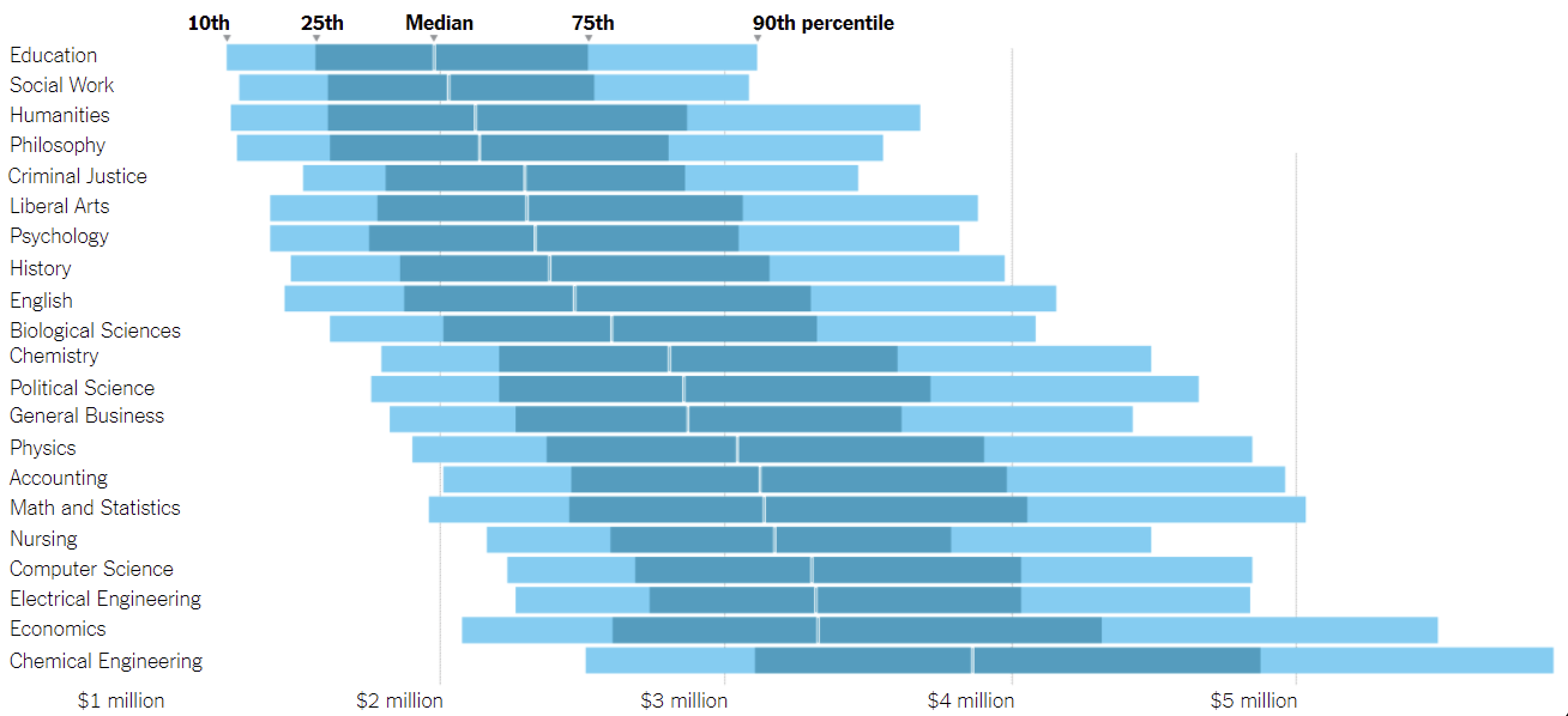
Source: New York Times
Answer
The image is a bar graph representing lifetime earnings potential for various academic disciplines, measured at the 10th, 25th, median, 75th, and 90th percentiles. The graph indicates that fields like Chemical Engineering, Economics, Electrical Engineering, and Computer Science have the highest earning potentials, especially in the higher percentiles. In contrast, fields like Education, Social Work, and Humanities tend to have lower lifetime earnings across all percentiles. The data visualizes a significant disparity in financial outcomes associated with different fields of study.
Example 5
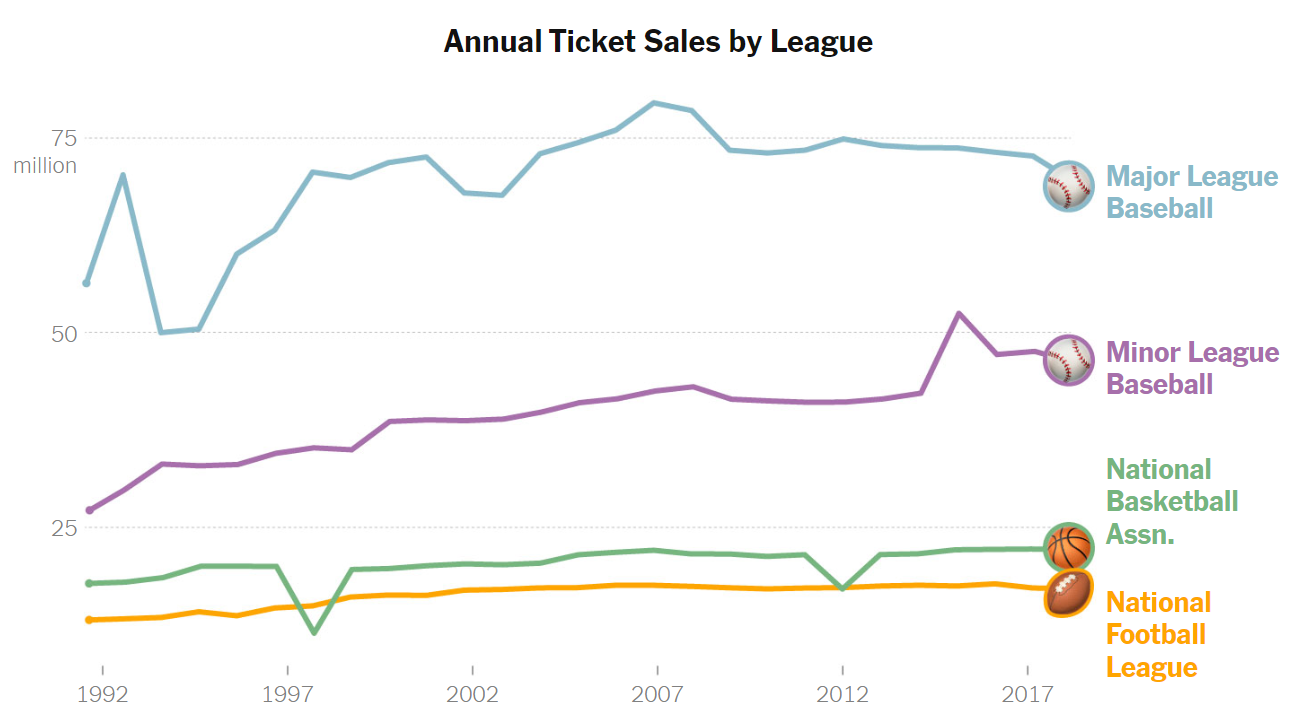
Source: New York Times
Answer
The graph displays annual ticket sales for major sports leagues from 1992 to around 2017. The data provides a comparative overview of the popularity and audience engagement of these leagues. Major League Baseball leads with the highest sales, peaking just below 80 million tickets. Minor League Baseball follows a steady trend around 40 million, until a recent, yet brief, spike around 2014. The National Basketball Association and the National Football League (NFL) show more modest, stable sales figures, both generally maintaining between 15 to 25 million tickets sold annually.
Example 6
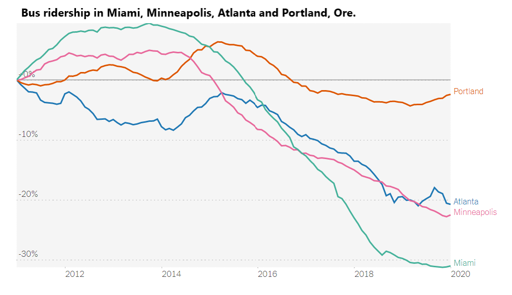
Source: New York Times
Answer
The graph depicts trends in bus ridership changes from approximately 2011 to 2020 in Miami, Minneapolis, Atlanta, and Portland, Oregon. Miami shows a dramatic decrease in ridership, dropping by more than 30%. Minneapolis and Atlanta exhibit similar patterns, both with significant declines, though not as severe as Miami's drop. Portland's ridership remains relatively stable, experiencing a minor decrease compared to the others. Overall, the graph illustrates a broad decline in bus ridership in these cities, with Portland maintaining the most stable trend over the period.
Example 7
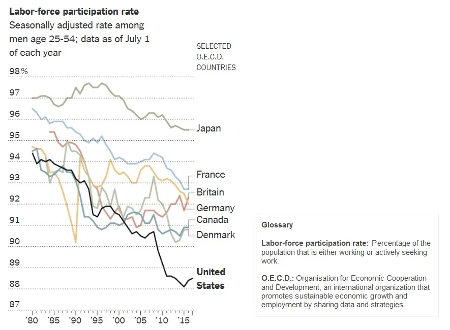
Source: New York Times
Answer
The graph displays the labor-force participation rate among men aged 25-54 in selected OECD countries from 1980 to 2017. All countries in the chart show a decline during this period, though the magnitude of the declines varies between countries. Japan maintains the highest rates throughout. Other nations, including France, Britain, Germany, Canada, and Denmark dropped less than 5 percentage points. However, the United States exhibits a more significant decline in participation rates, falling from near 95% in 1980 to approximately 88% by 2015.
Example 8
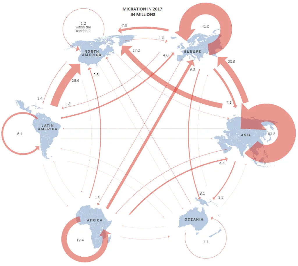
Source: New York Times
Answer
This infographic illustrates global migration patterns in 2017, highlighting the movement of millions of people between and within continents. Notable flows include 63.3 million people migrating within Asia, 41 million within Europe, and 26.4 million within North America. There were also significant flows from Latin America to North America (26.4 million) and from Asia to Europe (20.5 million). Generally speaking, there was more migration from regions with more developing countries like Africa, Asia, and Latin America to more developed regions like North America and Europe than vice-versa.
Example 9
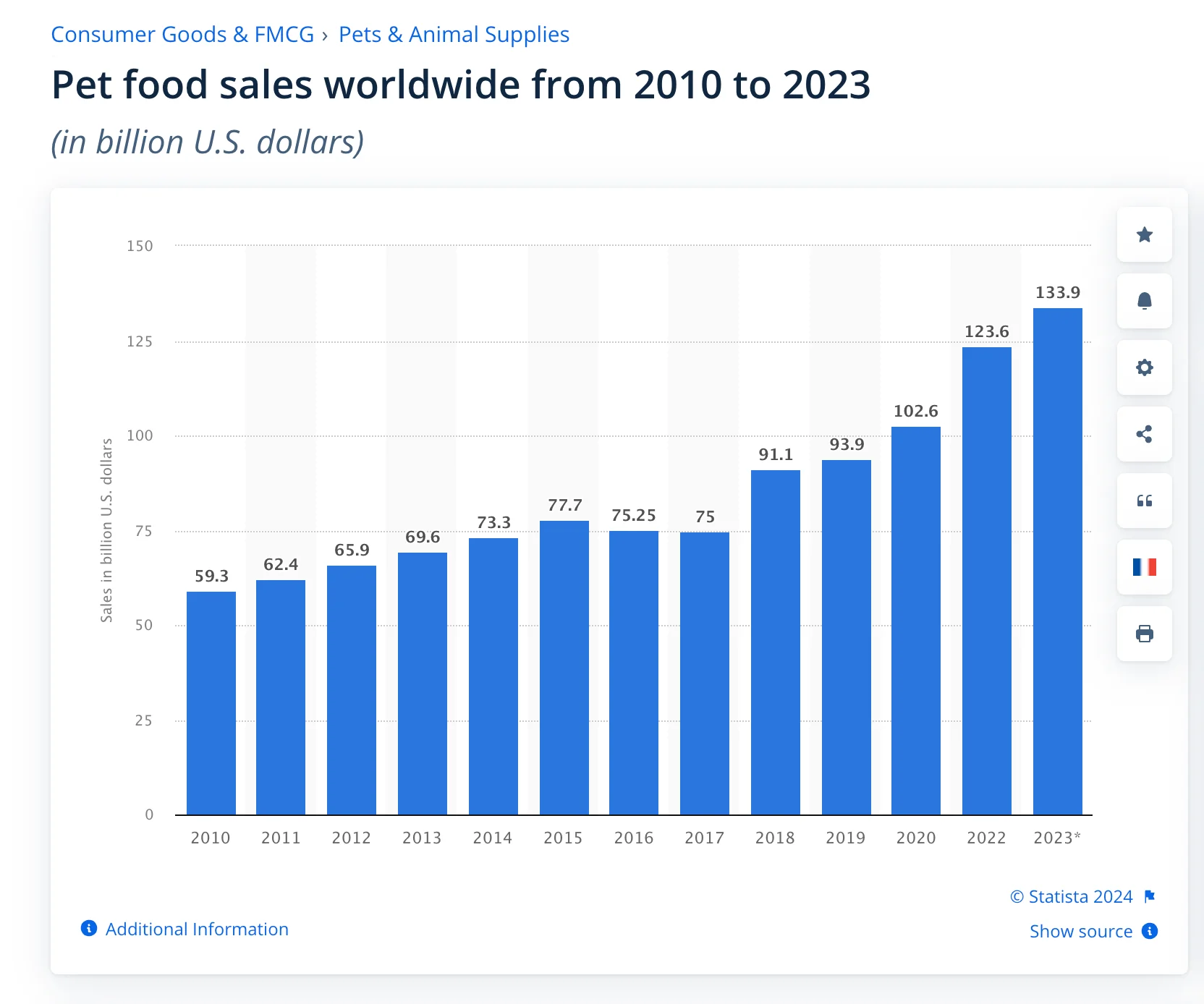
Source: Shopify
Answer
The bar chart illustrates global pet food sales from 2010 to 2023, expressed in billions of U.S. dollars. The sales have shown an overall increasing trend over the years. Starting at $59.3 billion in 2010, there's a steady growth, with a slight dip in 2016 and 2017. The sales rebound and grow at an even faster rate, peaking at $133.9 billion in 2023. Over the span of just 13 years, sales of pet food have more than doubled globally.
Example 10
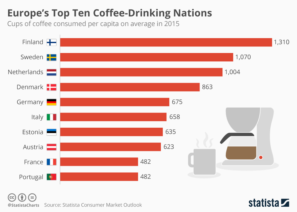
Source: Statista
Answer
This bar chart displays Europe's top ten coffee-drinking nations based on cups of coffee consumed per capita in 2015. In general, coffee consumption varies significantly between the countries. Finland leads significantly with 1,310 cups per person, followed by Sweden at 1,070, and the Netherlands with 1,004 cups. Denmark and Germany consume 863 and 675 cups respectively, showing moderate consumption. Italy, known for its coffee culture, surprisingly consumed just 658 cups. Estonia, Austria, France, and Portugal also make the list, each consuming between 482 and 635 cups per capita.
Example 11
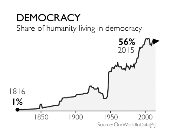
Source: Gapminder.org
Answer
This line graph illustrates the percentage of the world's population living under democratic governments from 1816 to 2015. In 1816, only 1% of humanity lived in democracies. The share remained relatively low until a noticeable increase starting around 1900. Significant growth in global democracy began around 1950 and continued to rise sharply through the late 20th century. The trend reached its peak in 2015, with 56% of the global population living in democratic nations. The chart highlights major gains in democracy post-World War II and through the end of the Cold War.
Example 12
Global Population, 1800 to 2100
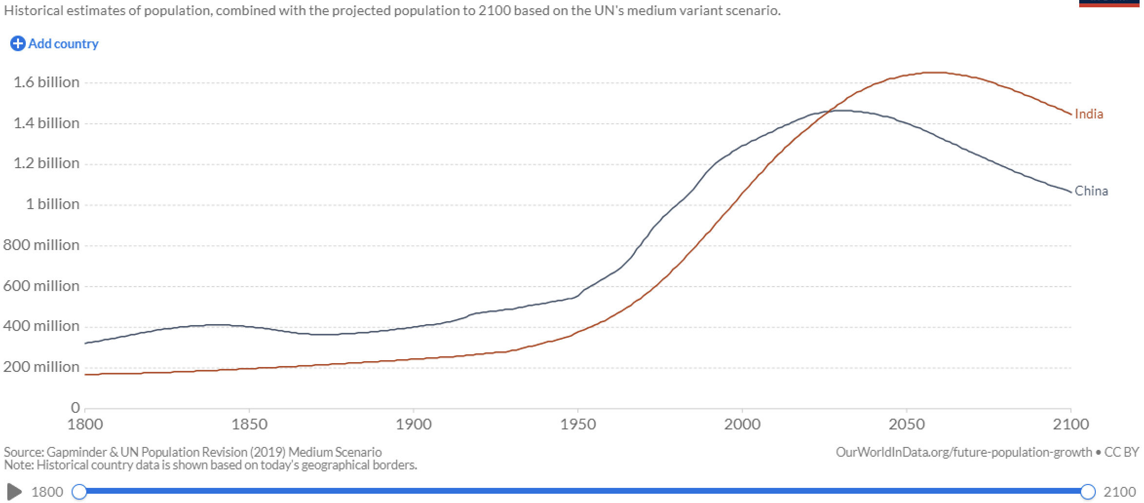
Source: Our World in Data
Answer
The graph compares the historical and projected population trends of India and China from 1800 to 2100. From 1800 to around 2020, China had a larger population than India. Both countries saw significant growth over time, but evidently India grew faster because eventually India's population surpasses or will surpass China's. The projection indicates that India's population will continue to rise, peaking around 2060, while China's population is expected to decline after 2030.
Example 13
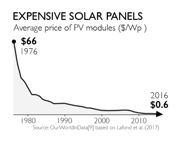
Source: Gapminder.org
Answer
The graph illustrates the significant decrease in the average price of PV modules from 1976 to 2016. In 1976, the price was $66 per watt. Over the next 40 years, the cost dramatically dropped, showing a steep decline especially from the 1976 and 1980. After that, the decline is more steady. By 2016, the price had decreased to just $0.6 per watt. This trend reflects substantial advancements in solar technology and increased manufacturing efficiency, making solar energy much more accessible and affordable over the decades.
Example 14
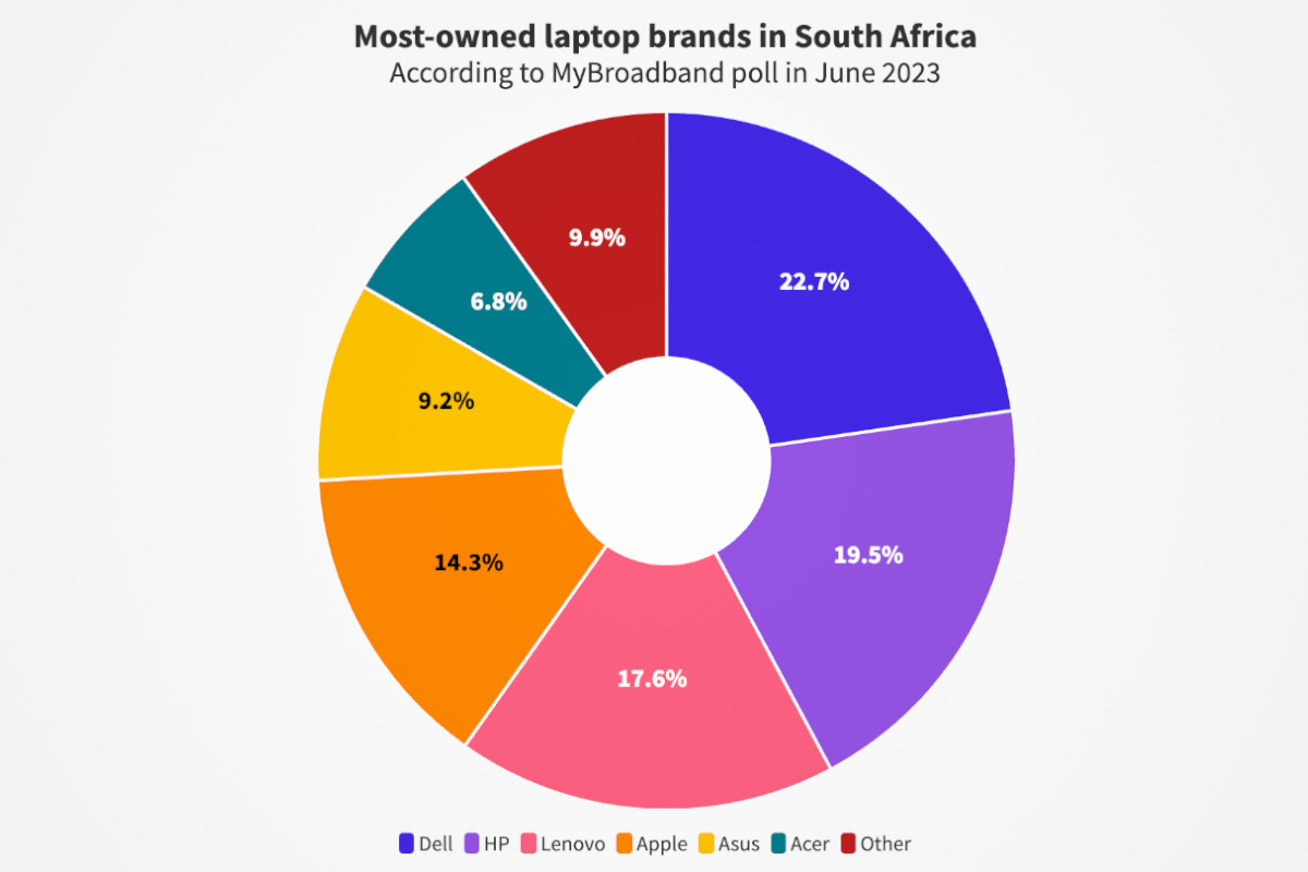
Source: MyBroadband
Answer
This pie chart displays the most-owned laptop brands in South Africa as of June 2023, based on a MyBroadband poll. Dell leads with 22.7% ownership, followed closely by HP at 19.5%. Lenovo holds 17.6%, and Apple has 14.3%. Asus and Acer have smaller shares at 9.2% and 6.8% respectively. The category labeled "Other" accounts for 9.9% of laptop ownership. Overall, the data indicates that there is not one dominant laptop brand in South Africa.
Example 15
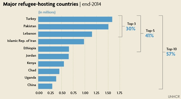
Source: UNHCR
Answer
This bar chart illustrates the major refugee-hosting countries as of the end of 2014. Turkey leads with the highest number of refugees, followed by Pakistan and Lebanon. These top three countries collectively host 30% of the world's refugees. The next two countries, the Islamic Republic of Iran and Ethiopia, bring the total hosted by the top five countries to 41%. The inclusion of Jordan, Kenya, Chad, Uganda, and China rounds out the top ten, which together accommodate 57% of the global refugee population, as reported by UNHCR.
Example 16
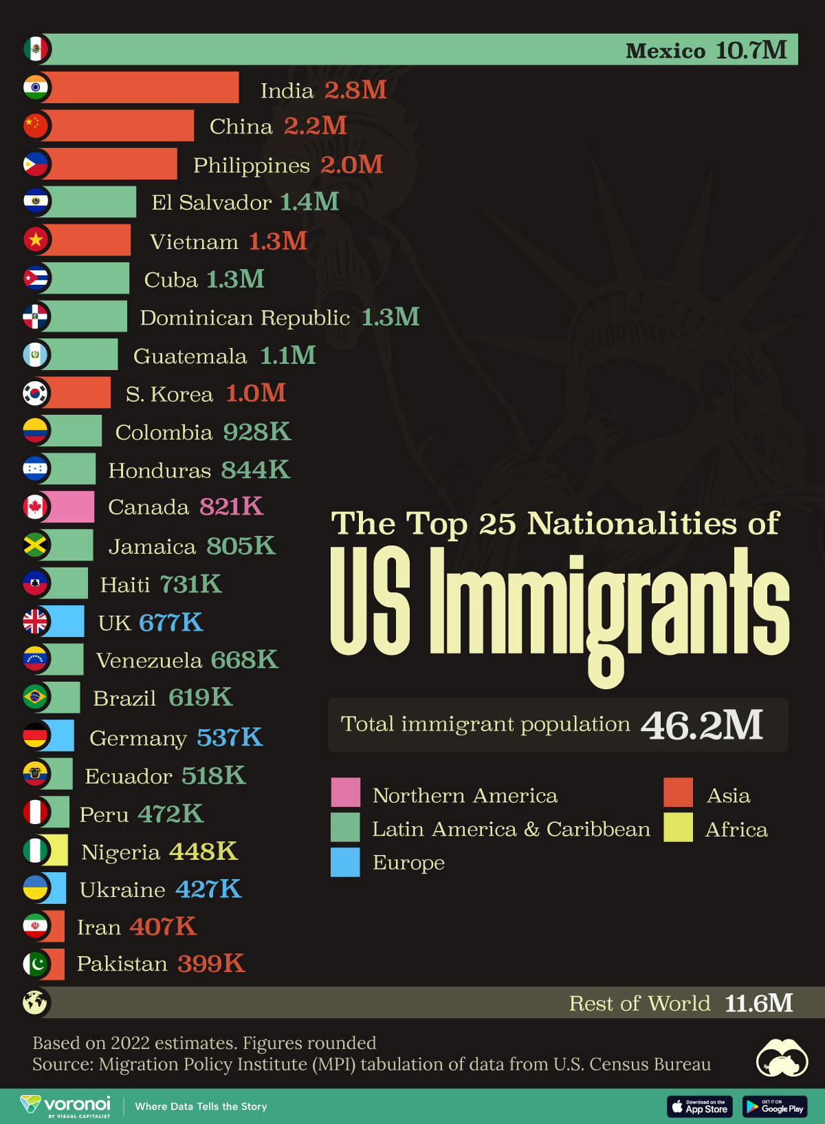
Source: Visual Capitalist
Answer
This bar chart lists the top 25 nationalities of immigrants in the United States, based on 2022 estimates. Mexico leads with 10.7 million immigrants, followed by India (2.8 million), China (2.2 million), and the Philippines (2.0 million). Other significant sources include El Salvador, Vietnam, Cuba, and the Dominican Republic, each contributing over 1 million immigrants. The graphic explicitly states a total immigrant population of 46.2 million, with a notable portion labeled as "Rest of World" accounting for 11.6 million.
Example 17
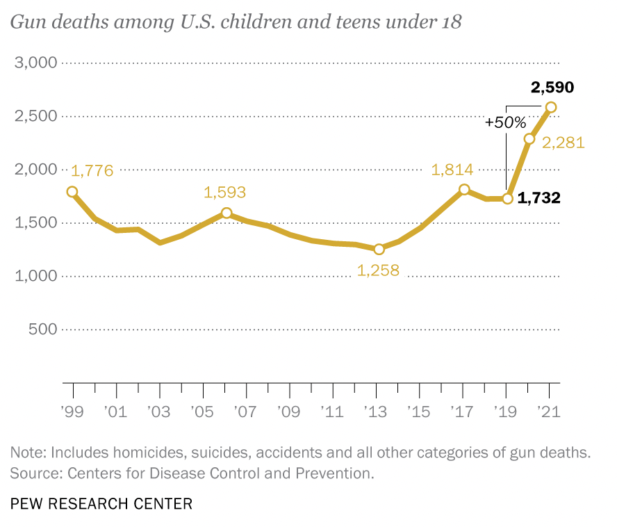
Source: Pew Research Center
Answer
This image shows a line graph depicting gun deaths among U.S. children and teens under 18 from 1999 to 2021. The number of deaths decreased from 1,776 in 1999 to a low of 1,258 in 2013. After that, the numbers started to rise, reaching 1,732 in 2019 and 2,590 in 2021, a rise of 50% in just 2 years. This is a worrying trend that calls for a forceful response.
Example 18
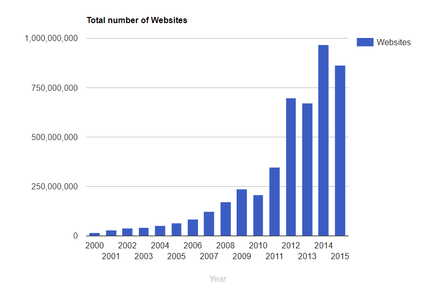
Source: SaaS Scout
Answer
This bar graph displays the total number of websites from 2000 to 2015. The growth of websites is gradual from 2000 to 2006, with a significant increase starting in 2007. In 2009, the number of websites surpassed 250 million. By 2012, the number of websites had more than doubled, reaching over 500 million. The most notable growth is between 2013 and 2014, where the number of websites skyrocketed to nearly 1 billion, peaking in 2014. The trend slightly declined in 2015 but remained close to 1 billion.
Example 19
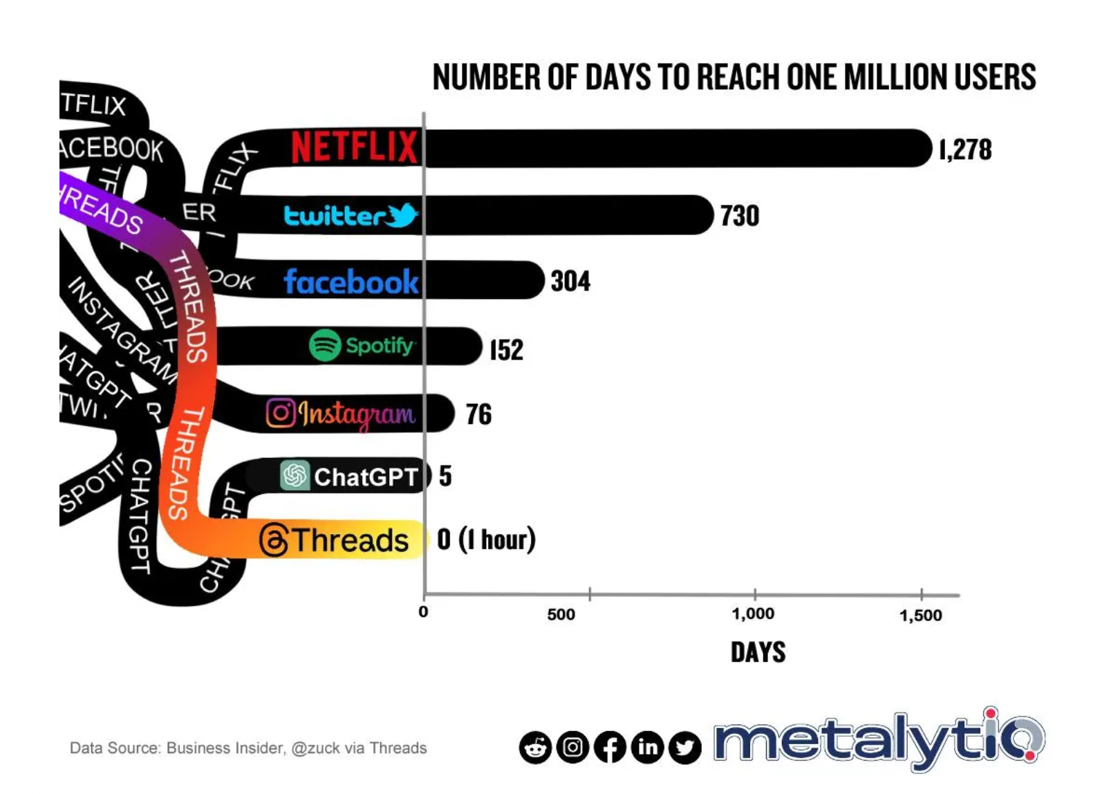
Source: Metalytiq
Answer
This bar graph displays the number of days it took various platforms to reach one million users. Netflix took the longest at 1,278 days, followed by Twitter with 730 days, and Facebook with 304 days. Spotify reached the milestone in 152 days, while Instagram did so in 76 days. ChatGPT achieved one million users in just 5 days. The most rapid growth was seen with Threads, which reached one million users in 0 days, essentially within one hour. The data highlights the accelerating pace at which new platforms can gain significant user bases.
Example 20
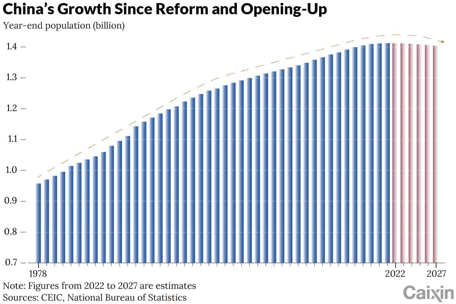
Source: Caixin Global
Answer
The bar graph shows China's population growth from 1978 to 2022 as well projections through 2027, reflecting the impact of the country's reform and opening-up policies. Starting at around 0.95 billion in 1978, the population steadily increases, reaching approximately 1.4 billion by 2022. Projections from 2022 to 2027 suggest a slight decline, with the population peaking and then gradually decreasing. The data source is the National Bureau of Statistics and the CEIC.
Example 21
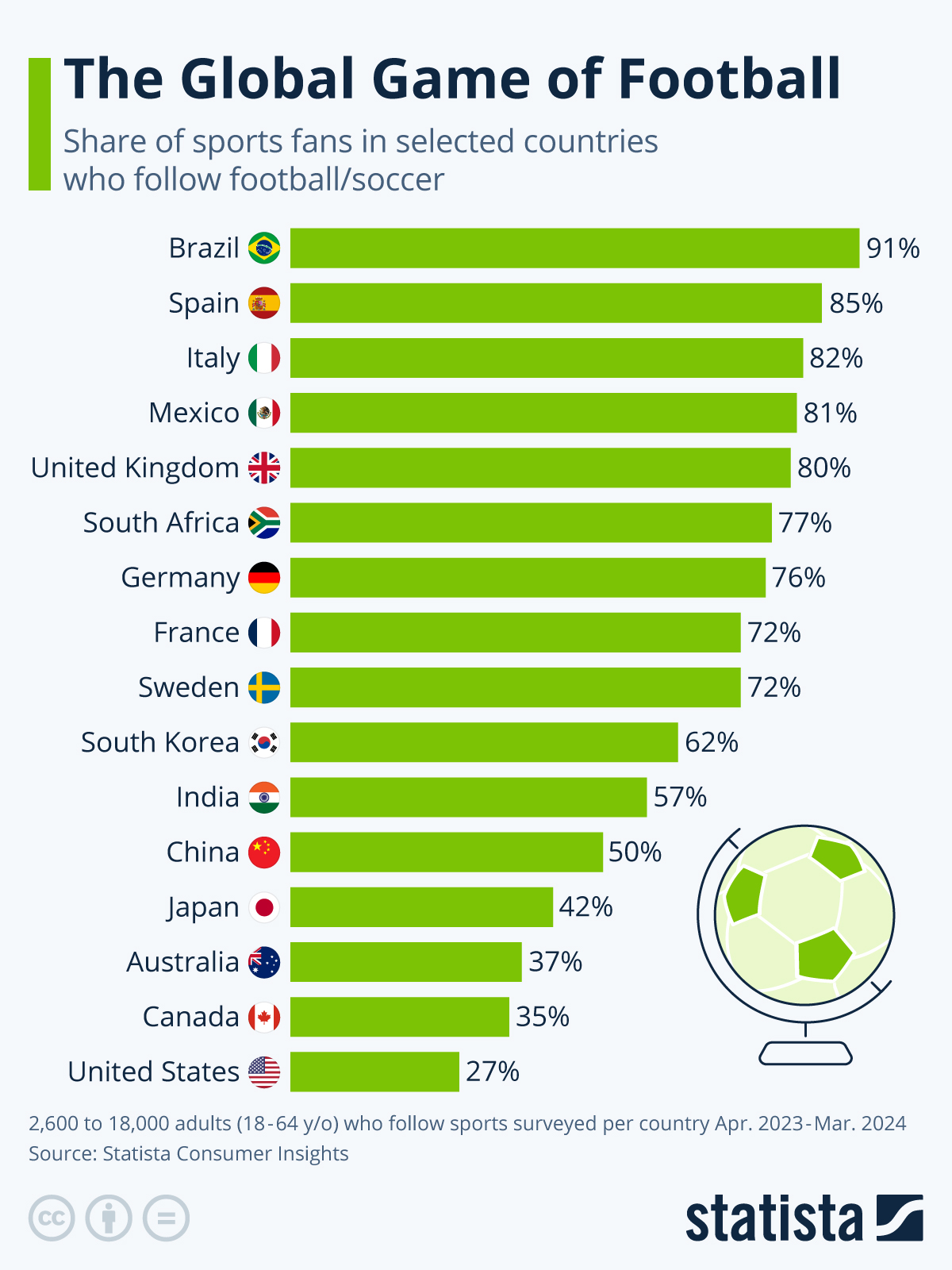
Source: Statista
Answer
This bar chart shows the percentage of sports fans in selected countries who follow football as of a survey conducted from April 2023 to March 2024. Brazil leads with 91% of its sports fans following football, followed by Spain at 85%, and Italy at 82%. The United Kingdom and Mexico also have high engagement rates at 80% and 81% respectively. In contrast, the United States has the lowest percentage, with only 27% of sports fans following football. Other countries like China, Japan, and Australia show moderate interest levels.
Example 22
Percent of children aged 0-17 living in poverty (2017)
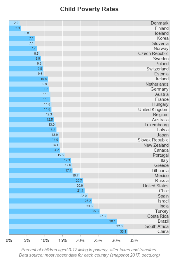
Source: OECD
Answer
This bar chart displays child poverty rates in various countries, representing the percentage of children aged 0-17 living in poverty after taxes and transfers. Denmark and Finland have the lowest rates at 2.9% and 3.3% respectively, indicating minimal child poverty. Conversely, South Africa and China have the highest rates, at 32.0% and 33.1% respectively, showing a significant portion of children living in poverty. The chart highlights substantial variations globally, with countries like the United States and Russia also showing considerable child poverty rates at 20.9% and 20.7% respectively.
Example 23
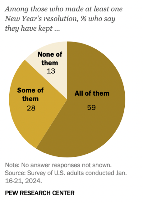
Source: Pew Research Center
Answer
This pie chart from the Pew Research Center presents data from a survey conducted in January 2024, detailing how U.S. adults have adhered to their New Year's resolutions. Among respondents who made at least one resolution, 59% reported that they have kept all of their resolutions, while 28% have kept some of them. Conversely, 13% admitted to not keeping any of their resolutions. This data illustrates a relatively high rate of commitment to New Year's resolutions among the surveyed group.
Example 24
Melanoma (skin cancer) incidence rate by age and sex in the United States, 2007-2011
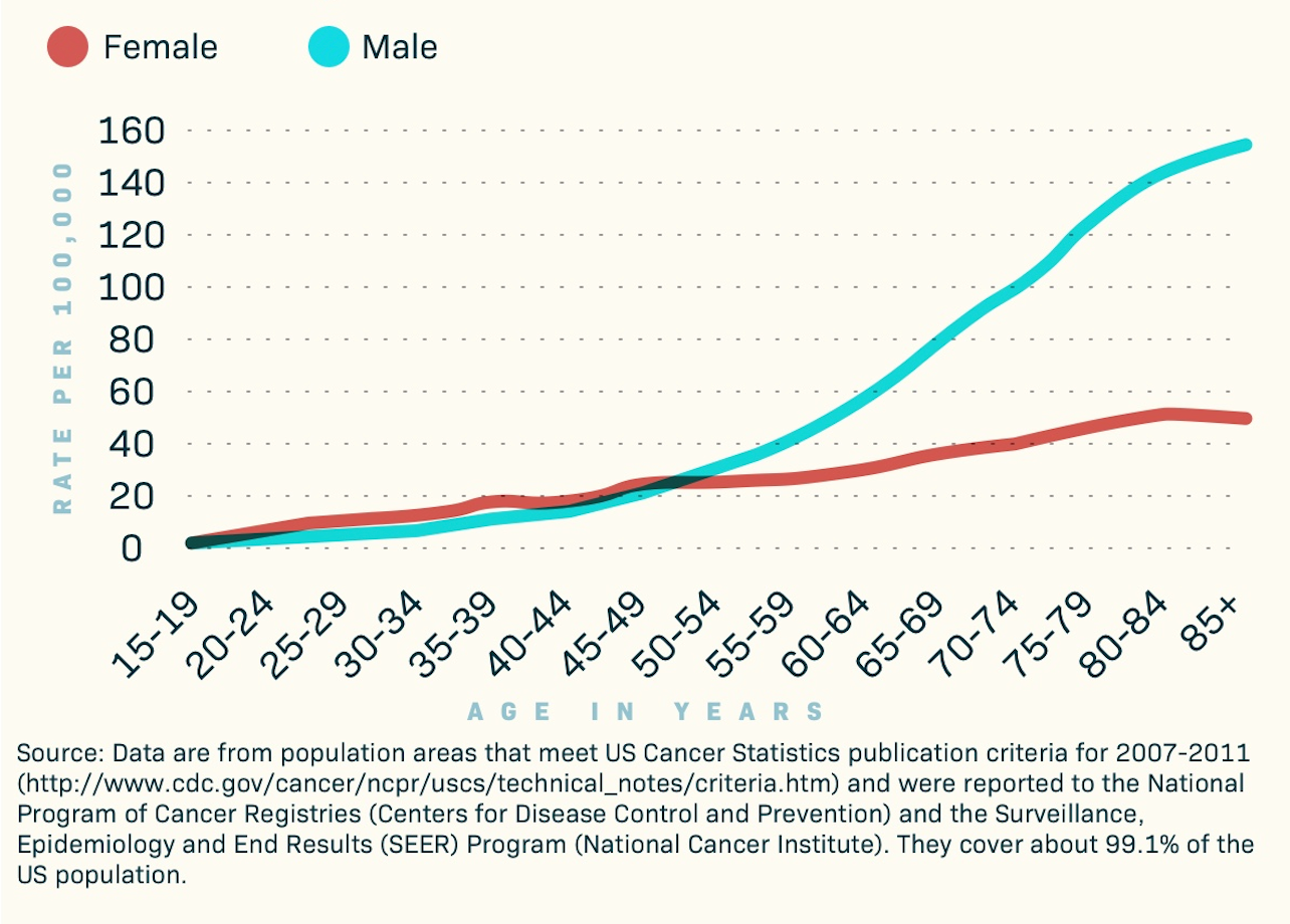
Source: SkinCancer.net
Answer
This line graph displays skin cancer incidence rates per 100,000 people, broken down by age and gender in the United States. The data covers 99.1% of the US population, so it is impressively comprehensive. The graph shows that rates increase with age for both males and females. Male cancer rates are consistently higher than female rates, particularly noticeable in older age groups. The graph highlights that the incidence rates for males start to significantly diverge from females beginning in the 55-59 age group and continue to increase steeply as age progresses.
Example 25
Source: The Economist
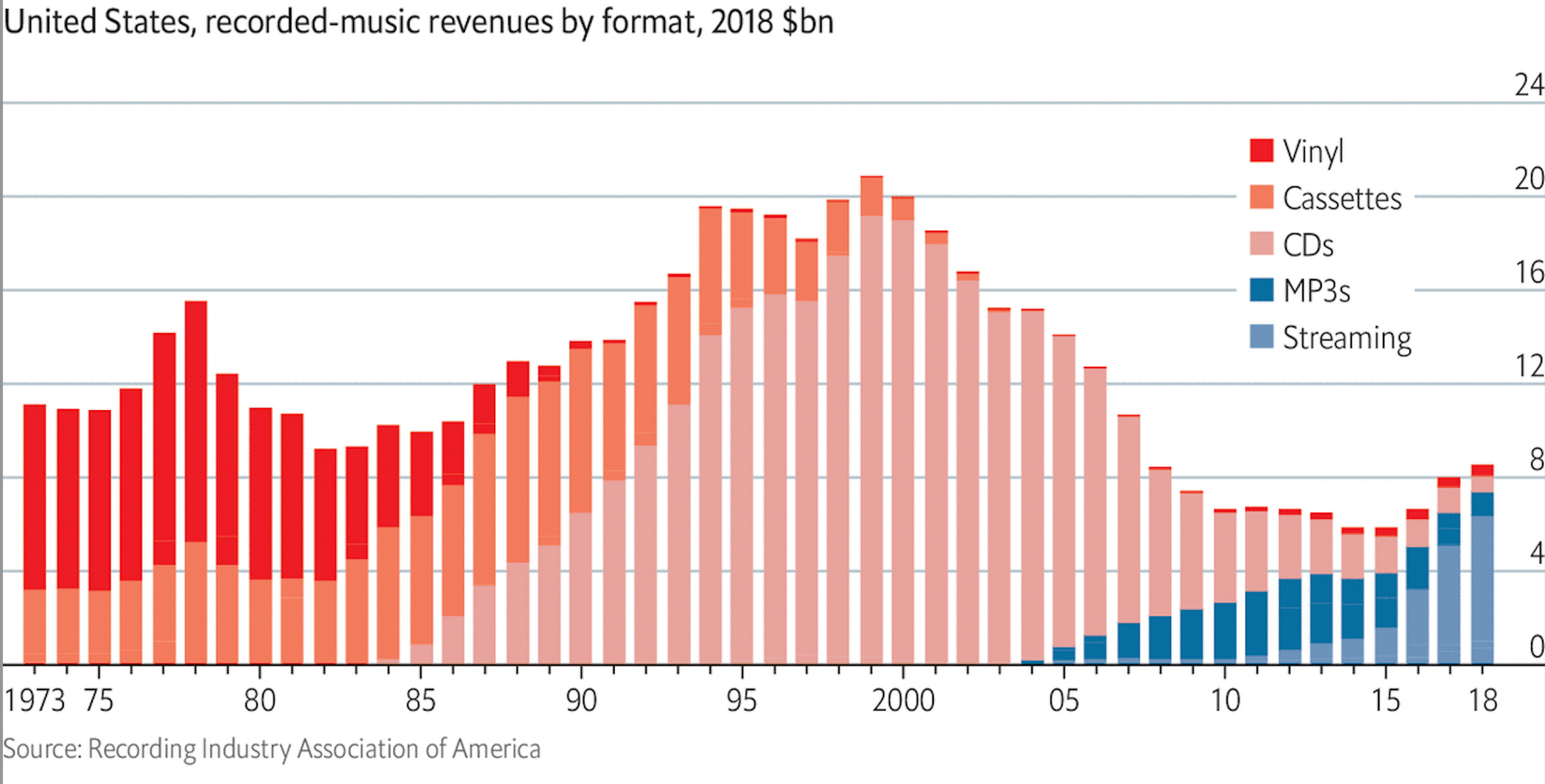
Answer
This stacked bar chart illustrates the evolution of recorded music revenues in the United States by format from 1973 to 2018. Initially, vinyl dominated the market, with cassettes and then CDs overtaking in revenue through the late 1980s and 1990s. CD sales peaked around 2000 and then declined sharply as digital formats emerged. MP3s began contributing to revenue in the early 2000s, but their impact was quickly surpassed by streaming services. By 2018, streaming became the most significant revenue source, while vinyl, cassettes, and CDs showed greatly reduced but persistent market presence.
Example 26
Source: Gapminder.org
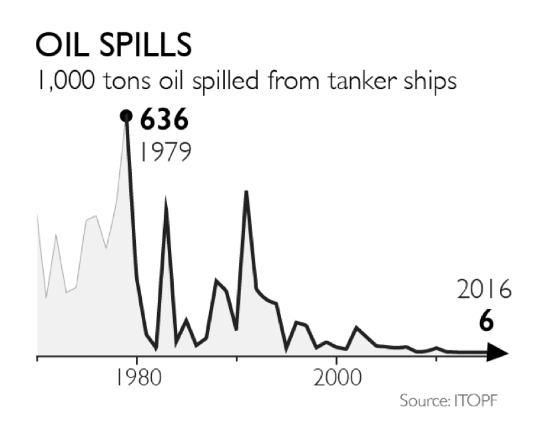
Answer
This line graph presents the amount of oil spilled from tanker ships in thousands of tons, spanning from sometime before 1980 to 2016. The graph shows a dramatic peak in 1979 with 636,000 tons spilled, marking the highest point of oil spills. Following this peak, there are several significant spikes, particularly noticeable through the 1980s. From the 1990s onward, the frequency and volume of oil spills sharply decline, reaching a low of just 6,000 tons in 2016, indicating a substantial reduction in major oil spills from tanker ships over the decades.
Example 27
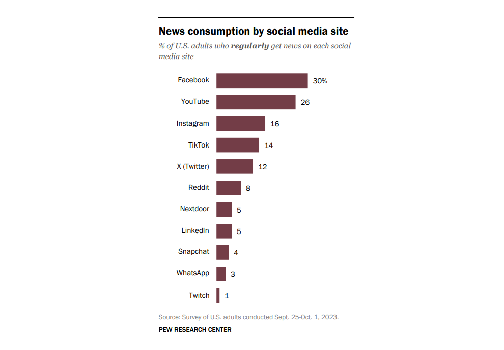
Source: Pew Research Center
Answer
This bar chart illustrates the percentage of U.S. adults who regularly get news from various social media sites, based on a survey conducted from September 25 to October 1, 2023. Facebook leads as the most common source with 30% of adults using it for news, followed by YouTube at 26%. Instagram and TikTok are also popular, with 16% and 14% respectively. Lesser-used platforms include X (Twitter) at 12%, Reddit at 8%, and LinkedIn and Nextdoor each at 5%. Snapchat, WhatsApp, and Twitch have even lower percentages.
Example 28
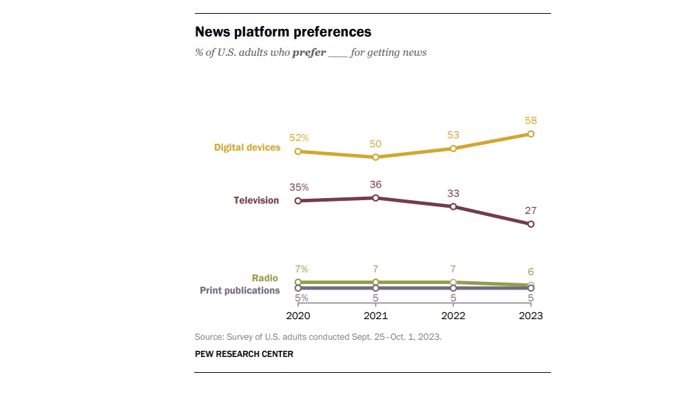
Source: Pew Research Center
Answer
This multi-line graph depicts the preferences of U.S. adults for different news platforms from 2020 to 2023, based on Pew Research Center surveys. It shows a significant increase in the preference for digital devices, rising from 52% in 2020 to 58% in 2023. Conversely, television saw a decline from 35% to 27% over the same period. Radio and print publications remained relatively stable but low, with radio decreasing slightly from 7% to 6%, and print steady at 5%.
Example 29
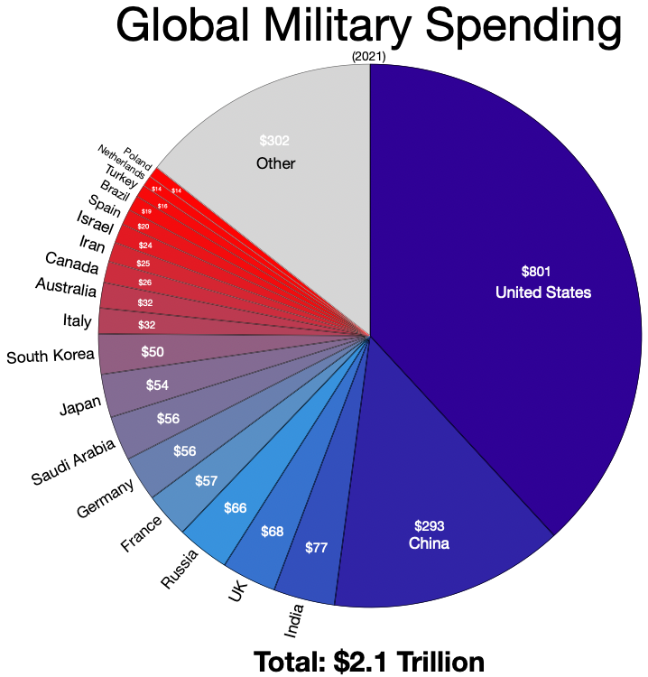
Source: Wikimedia
Answer
This pie chart details global military spending for the year 2021, totaling $2.1 trillion. The United States leads with a significant portion, spending $801 billion, which is far more than any other country. China follows with $293 billion. Other major contributors include India ($77 billion), the UK ($68 billion), Russia ($66 billion), and France ($57 billion). Countries like Saudi Arabia, Japan, Germany, and South Korea also feature, each spending between $50 and $57 billion. The segment labeled "Other" sums up $302 billion, accounting for the combined spending of numerous other countries. This visualization underscores the substantial disparity in military expenditures between the U.S. and the rest of the world.
Example 30
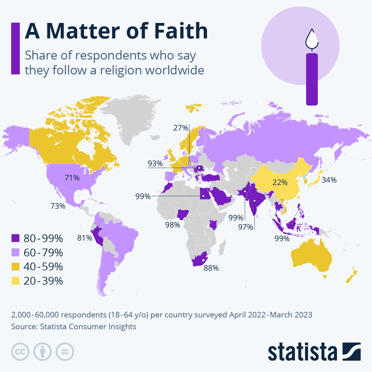
Source: Statista
Answer
This map displays the percentage of respondents who follow a religion worldwide, based on a survey conducted from April 2022 to March 2023. It illustrates significant global variation in religious following.Countries with high religious adherence (80-99%) are shown in dark purple, including Pakistan (99%), several Middle Eastern countries, and Africa. Medium purple (60-79%) appears in Brazil (81%) and other areas. Lower rates (40-59% and 20-39%) are marked in lighter shades, seen in China (34%) and European countries like France (27%).
Example 31
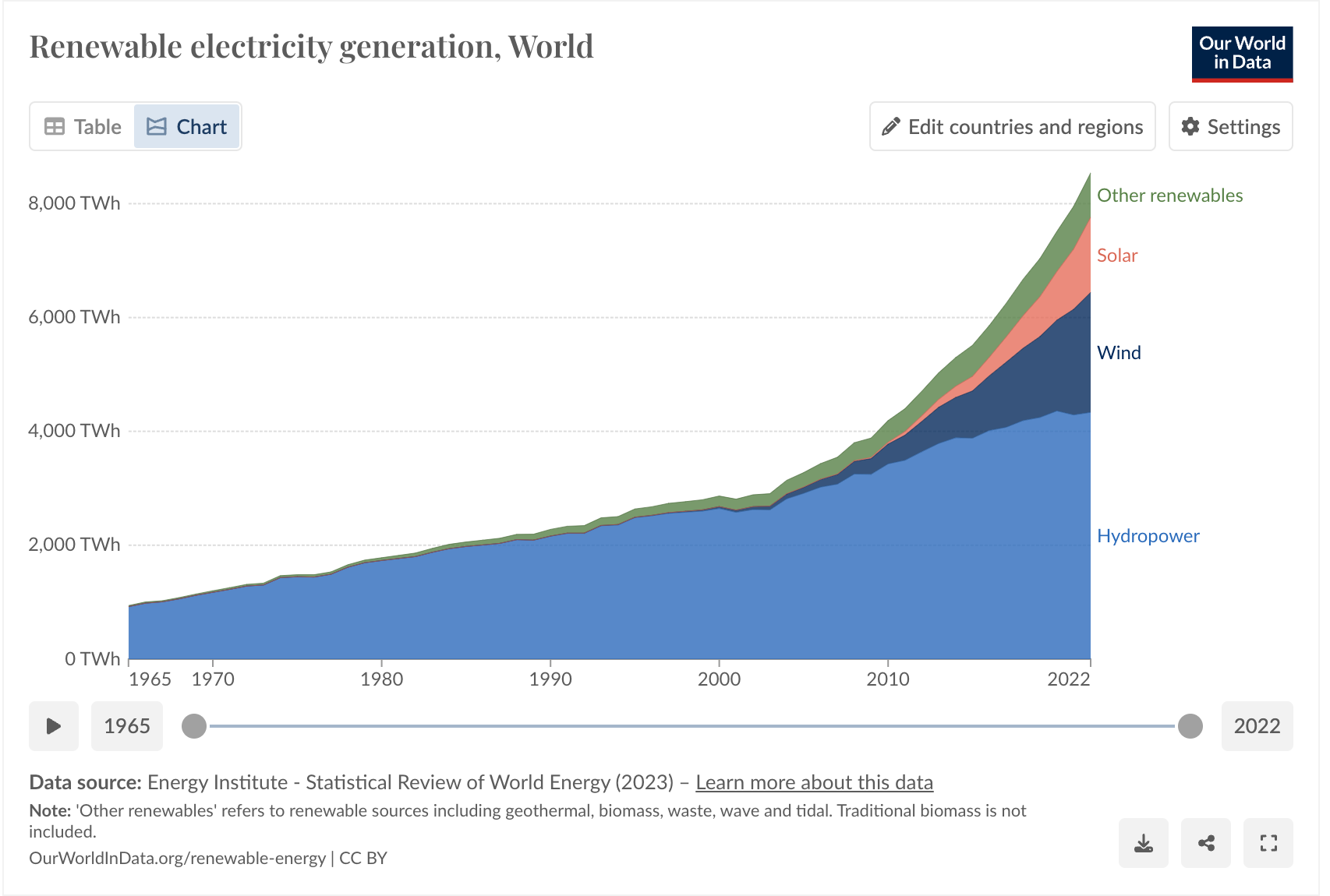
Source: Our World in Data
Answer
This graph shows the growth in renewable electricity generation worldwide from 1965 to 2022. Hydropower has been the dominant source for decades, with substantial growth over the period. In recent years, wind and solar energy have shown significant increases, contributing more to the total renewable generation. Wind energy, in particular, has seen rapid growth since the early 2000s, and solar energy's rise has been even steeper, especially after 2010. Other renewables, including geothermal, biomass, waste, wave, and tidal, also contribute but to a lesser extent.
Example 32
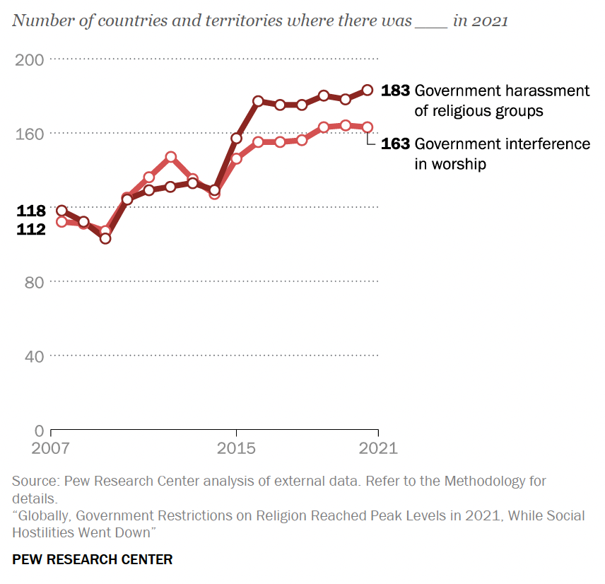
Source: Pew Research Center
Answer
This double line graph tracks government harassment of religious groups and government interference in worship across various countries and territories from 2007 to 2021. It shows an increasing trend in both forms of government actions. In 2007, the numbers were relatively lower, with 118 countries experiencing government harassment and 112 countries facing interference in worship. By 2021, these numbers had escalated to 183 countries facing harassment and 163 experiencing interference, indicating a significant rise in government restrictions on religious practices globally over the 14-year period.
Example 33
Individuals using the internet (% of the population)
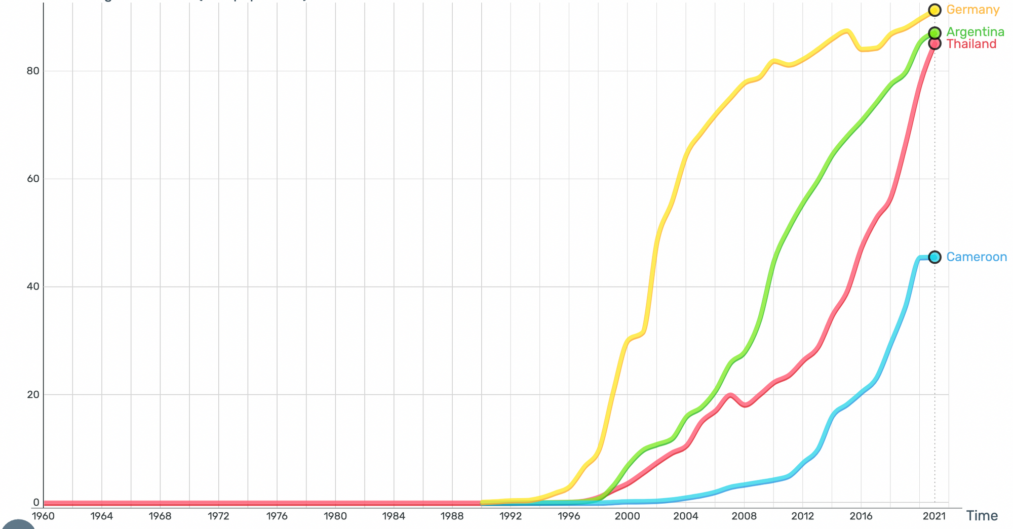
Source: Gapminder.org
Answer
The line graph illustrates the percentage of individuals using the internet in Germany, Argentina, Thailand, and Cameroon from 1960 to around 2021. Internet usage in Germany, Argentina, and Thailand shows rapid growth from the late 1990s, with all three countries achieving high penetration rates above 80% by 2021. Germany's growth is the steepest, closely followed by Thailand and Argentina, indicating widespread internet adoption. In contrast, Cameroon shows a more gradual increase and a significantly lower penetration rate, reaching just above 40% by 2021, highlighting disparities in internet access.
Example 34
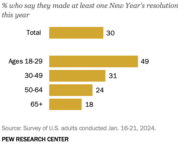
Source: Pew Research Center
Answer
This bar chart from the Pew Research Center displays the percentage of U.S. adults who made at least one New Year's resolution in January 2024. Overall, 30% of adults made a resolution. The data is broken down by age groups, showing that younger adults (ages 18-29) are the most likely to make resolutions, with 49% doing so. This rate decreases with age: 31% of adults aged 30-49, 24% of those aged 50-64, and only 18% of those aged 65 and older made resolutions.
Example 35
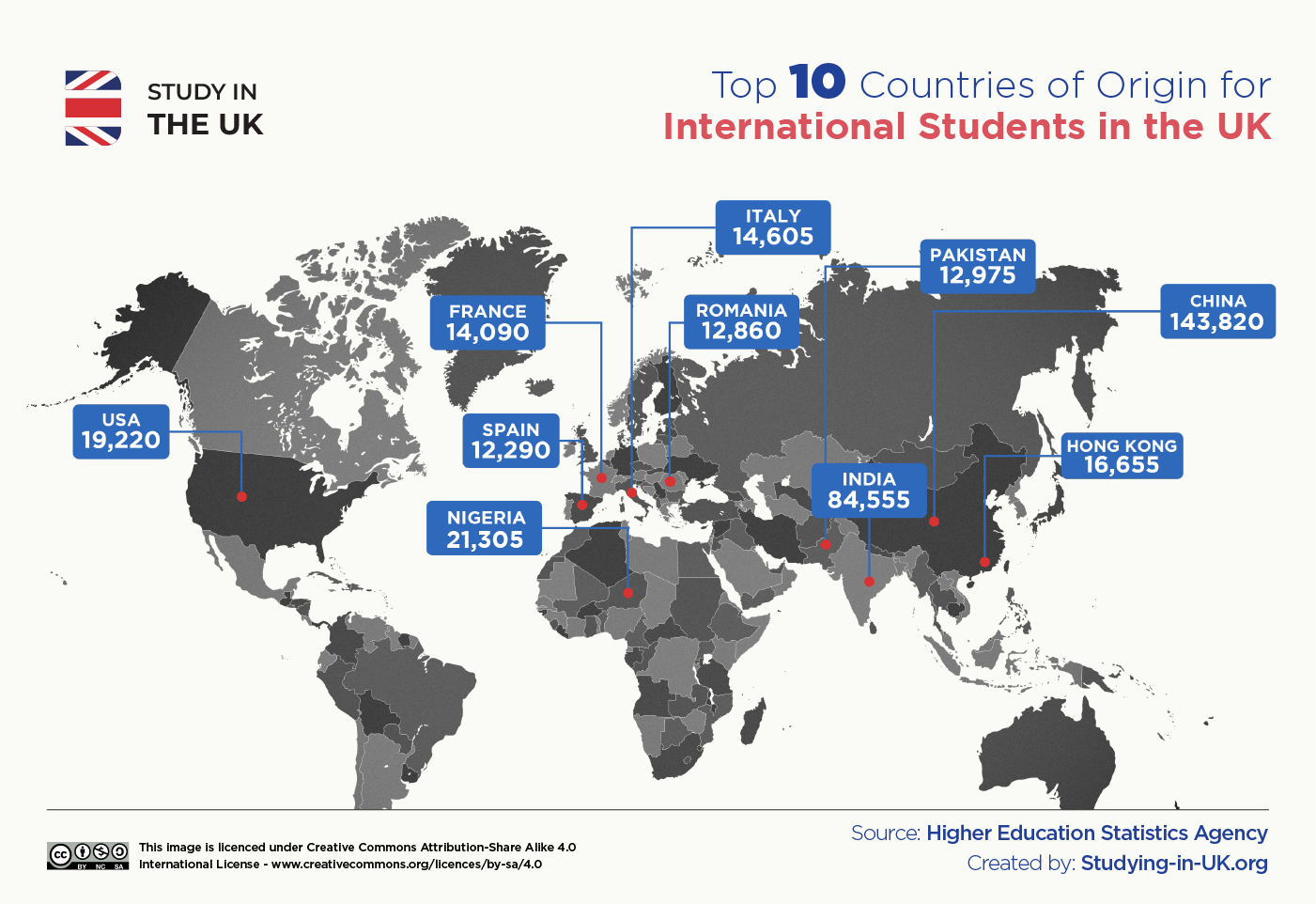
Source: Study in the UK
Answer
The map visualizes the top 10 countries of origin for international students studying in the UK. It highlights China as the leading source with 143,820 students, followed by India with 84,555 students. Other notable countries include Nigeria (21,305), the USA (19,220), Hong Kong (16,655), France (14,090), Italy (14,605), Romania (12,860), Pakistan (12,975), and Spain (12,290). Interestingly, no data is shown for any countries in Latin America, suggesting that there are not many students from that region who study abroad in the UK.
Example 36
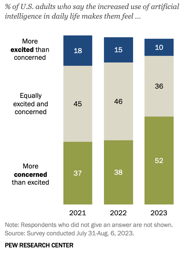
Source: Pew Research Center
Answer
This bar chart from the Pew Research Center shows the percentage of U.S. adults' feelings toward the increased use of artificial intelligence (AI) in daily life, surveyed from 2021 to 2023. In 2021, 18% felt more excited than concerned, decreasing to 10% by 2023. Those equally excited and concerned remained stable at 45% in 2021 and 46% in 2022, then dropped to 36% in 2023. Meanwhile, the proportion more concerned than excited rose from 37% in 2021 to 52% in 2023, indicating growing apprehension about AI among U.S. adults over these years.
Example 37
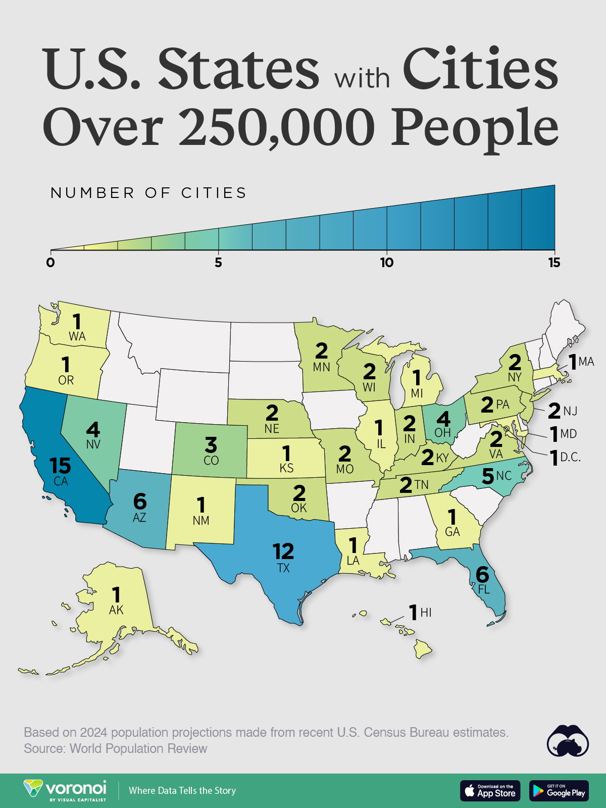
Source: Visual Capitalist
Answer
This image is a map of the United States, highlighting states that have cities with populations over 250,000 based on 2024 population projections from U.S. Census Bureau estimates. Each state is color-coded and labeled with the number of such cities. California leads with 15 cities, followed by Texas with 12 and Florida with 6. Other states with multiple large cities include Arizona (6), Colorado (3), and North Carolina (5). States like Washington, Oregon, and Alaska each have one city over 250,000.
Example 38
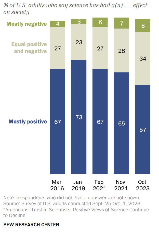
Source: Pew Research Center
Answer
This stacked bar chart displays the percentages of U.S. adults who believe science has had a mostly positive, equal positive and negative, or mostly negative effect on society, across five different surveys from March 2016 to October 2023. The proportion of adults viewing science as mostly positive declined from 67% in March 2016 to 57% in October 2023. The percentage seeing science as equally positive and negative increased slightly over the years, while the view of science as mostly negative grew from 4% in 2016 to 8% in 2023. My broad inference from the chart is that respect for science has been on the decline.
Example 39
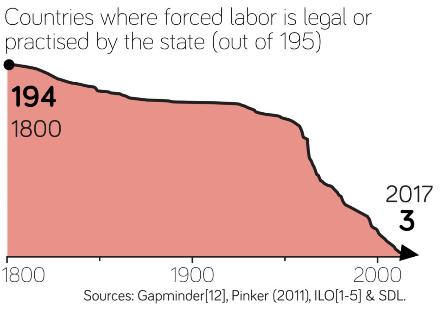
Source: Gapminder.org
Answer
This line graph illustrates the decline in the number of countries where forced labor is legal or practiced by the state from 1800 to 2017. In 1800, 194 out of 195 countries legally or officially practiced forced labor. Over time, this number gradually decreased, showing a significant decline particularly in the 20th century, and reaching a low of 3 countries by 2017. This demonstrates a substantial global reduction in the acceptance and practice of state-sanctioned forced labor over the past two centuries.
Example 40
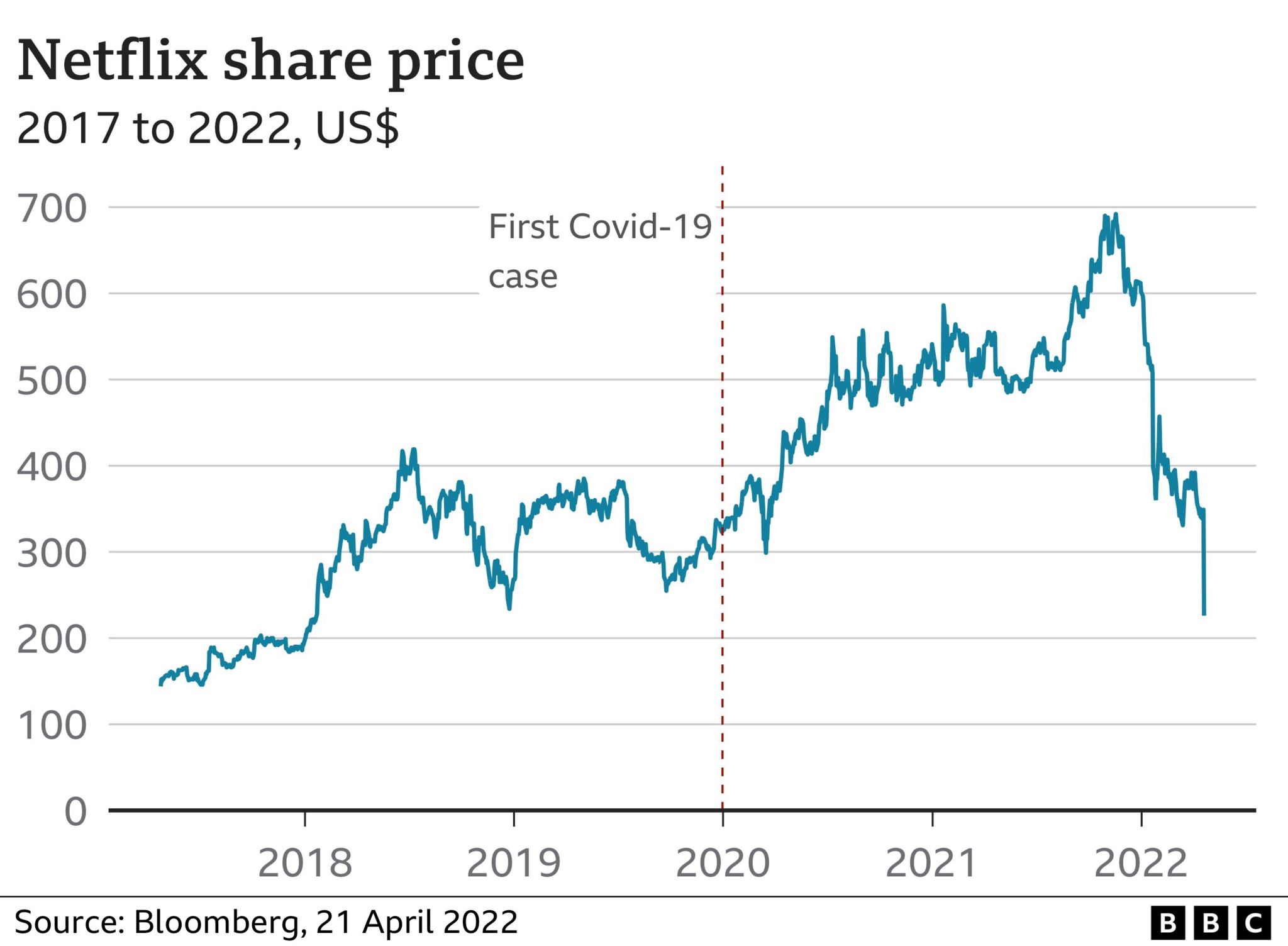
Source: BBC
Answer
This line graph shows the performance of Netflix's share price from 2017 to 2022. The share price experienced significant fluctuations during this period. After some initial variability, there was a sharp increase starting in early 2020, coinciding with the onset of the COVID-19 pandemic, indicated by the dotted vertical line. This peak is followed by a steep rise to over $600 in 2021 before a dramatic decline occurs, bringing the share price back down significantly by early 2022, ending just above $200.
Example 41
Source: Gapminder.org
Answer
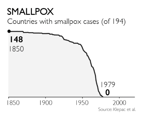
This line graph illustrates the decline in the number of countries with smallpox cases out of 194 total countries from 1850 to 1979. In 1850, 148 countries reported smallpox cases. The number of affected countries gradually decreased over the years, with a more significant decline starting around 1950. By 1979, smallpox was eradicated, with zero countries reporting cases. This timeline highlights the successful global efforts to eliminate smallpox.
Example 42
Source: RankingRoyals
Answer
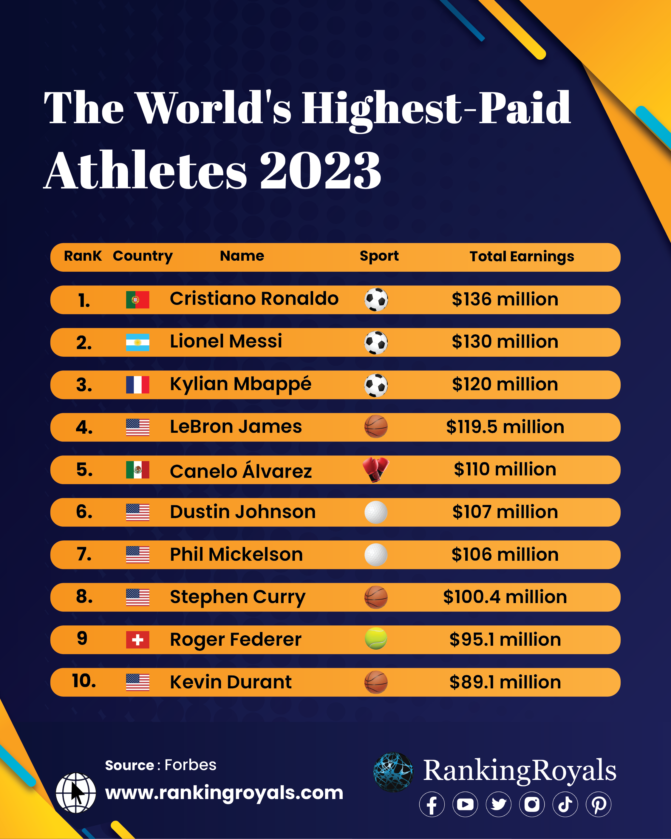
The image presents the list of the world's highest-paid athletes for 2023. Cristiano Ronaldo tops the list with total earnings of $136 million, followed by Lionel Messi with $130 million, and Kylian Mbappé with $120 million. LeBron James is fourth with $119.5 million, and Canelo Álvarez is fifth with $110 million. Other athletes in the top ten include Dustin Johnson ($107 million), Phil Mickelson ($106 million), Stephen Curry ($100.4 million), Roger Federer ($95.1 million), and Kevin Durant ($89.1 million). One thing that stands out to me is the diversity of sports represented in the list.
Example 43
Source: Gapminder.org
Answer
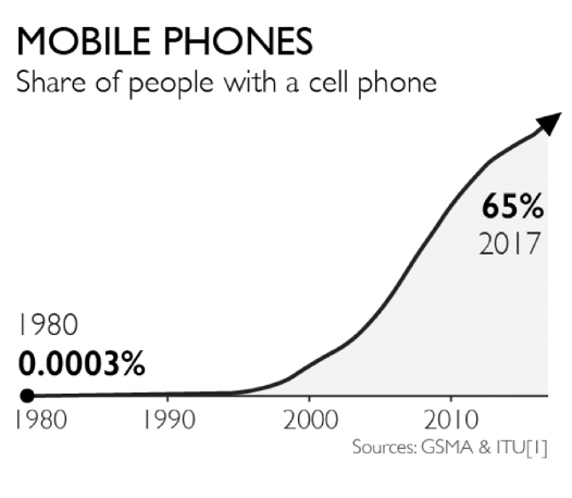
This line graph shows the rapid increase in the share of people with a cell phone from 1980 to 2017. In 1980, the share was almost negligible at 0.0003%. Over the following decades, the adoption of mobile phones grew significantly, especially between 2000 to 2010. After 2010, the growth slows a bit, but it is still significant. By 2017, the share of people with a cell phone had risen to 65%.
Example 44
Source: Statista
Answer
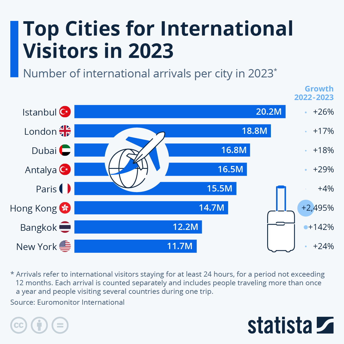
This bar graph lists the top cities for international visitors in 2023, also indicating the number of international arrivals per city and their growth rates from 2022 to 2023. Istanbul leads with 20.2 million visitors, a 26% increase. London follows with 18.8 million visitors, up 17%, and Dubai with 16.8 million visitors, a growth of 18%. Antalya and Paris have 16.5 million and 15.5 million visitors respectively, with Antalya seeing a 29% increase and Paris 4%. Hong Kong experienced the highest growth of 2,495%, reaching 14.7 million visitors. Bangkok and New York complete the list with 12.2 million and 11.7 million visitors, showing increases of 142% and 24% respectively.
Example 45
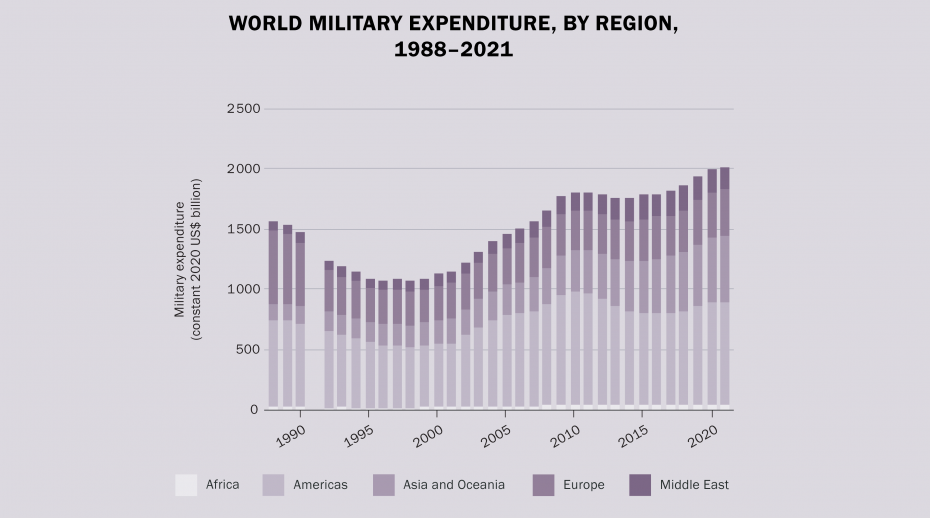
Source: Stockholm International Peace Research Institute
Answer
The image depicts world military expenditure by region from 1988 to 2021, measured in constant 2020 US dollars. The chart shows expenditure levels for Africa, the Americas, Asia and Oceania, Europe, and the Middle East. Military spending globally started at around $1500 billion in 1988, decreased in the 1990s, and began to rise again in the early 2000s. By 2021, military expenditure had increased to nearly $2000 billion or $2 trillion dollars. The Americas consistently have the highest expenditure, followed by Europe and Asia and Oceania. The Middle East and Africa have relatively lower spending.
Example 46
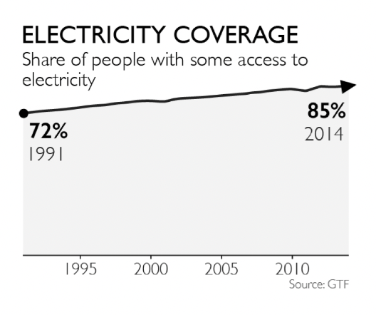
Source: Gapminder.org
Answer
This line graph shows increase in global electricity coverage from 1991 to 2014. In 1991, 72% of people had some access to electricity. Over the next two decades, this percentage steadily increased. By 2014, the share of people with access to electricity had risen to 85%. The graph illustrates a gradual upward trend in electricity access, indicating significant progress in extending electricity services to more people worldwide over the 23-year period.
Example 47
Average daily income (US Dollar per person per day, inflation- & price-adjusted)
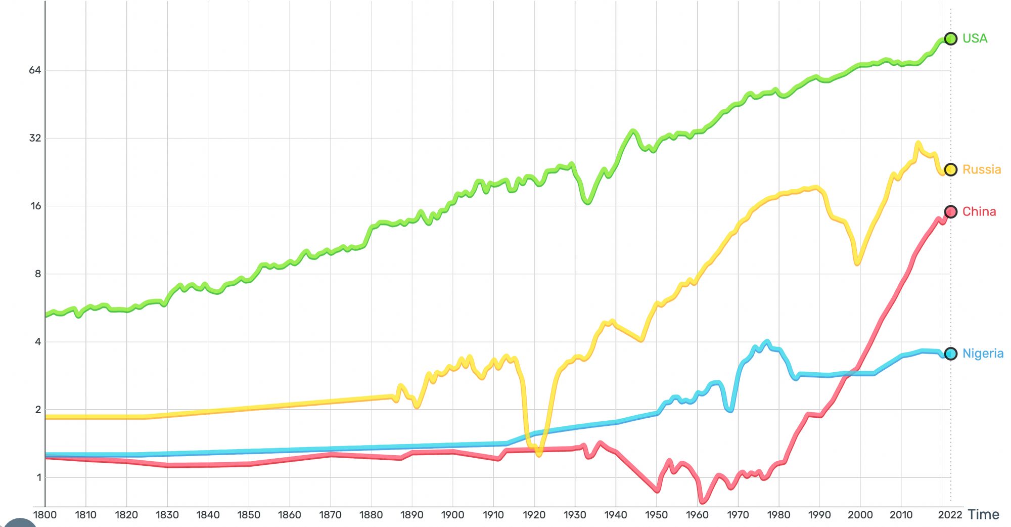
Source: Gapminder.org
Answer
This image contains line graph showing the average daily income per person in USD, adjusted for inflation and price, from 1800 to 2022 for the USA, Russia, China, and Nigeria. The USA (green line) exhibits a consistent and significant increase in average daily income, peaking in 2022. Russia (yellow line) shows fluctuating income levels, with notable dips around the early 20th century, but overall growth into 2022. China's (red line) income dramatically rises, especially post-1970, with a steep increase toward 2022. Nigeria (blue line) demonstrates more gradual and moderate growth in income, with slight fluctuations over time, and generally stagnation since 1980.
Example 48
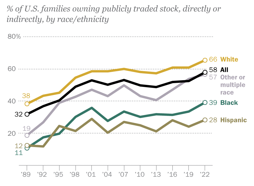
Source: Pew Research Center
Answer
This image shows a line graph with multiple data series, depicting the percentage of U.S. families owning publicly traded stock, directly or indirectly, from 1989 to 2022, broken down by race/ethnicity. The ownership rates for White families rose from 38% in 1989 to 66% in 2022, consistently higher than other groups in every year in the chart. Black families saw an increase from 11% to 39%, while Hispanic families grew from 12% to 28%. Families of other or multiple races started at 32% and ended at 57%. The overall ownership percentage for all U.S. families rose from 32% to 58% over the same period. Overall, the chart makes clear the racial/ethnic disparities in family wealth in the United States.
Example 49
Garbage concentration in the Pacific Ocean, 2022
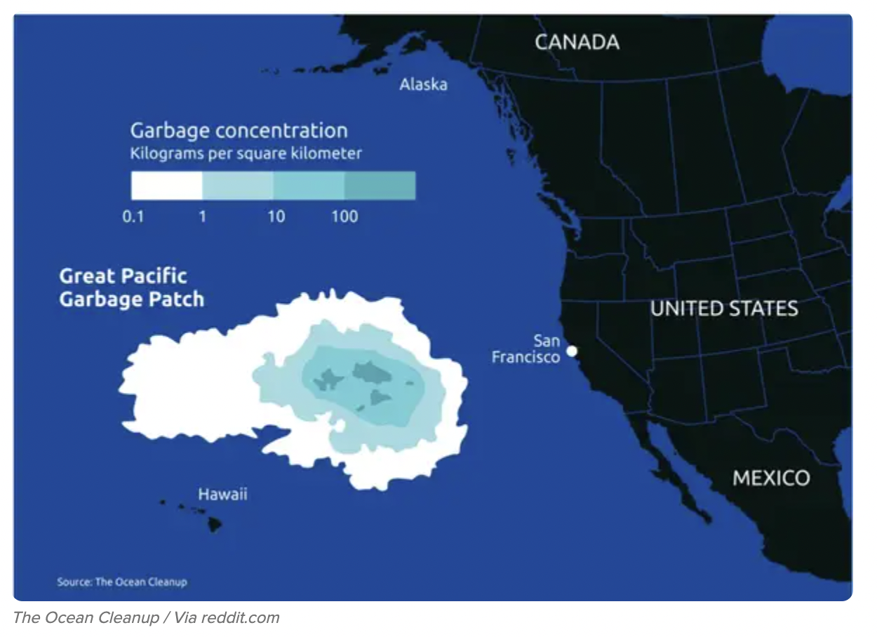
Source: The Ocean Cleanup
Answer
The image depicts the Great Pacific Garbage Patch, located between Hawaii and the western coast of North America. It is alarmingly large. The image highlights the concentration of garbage in the ocean, measured in kilograms per square kilometer. The garbage concentration ranges from 0.1 to over 100 kilograms per square kilometer, with the densest areas shown in darker shades of blue. The map provides a visual representation of the significant accumulation of marine debris in the central North Pacific Ocean, emphasizing the severity of oceanic plastic pollution.
Example 50
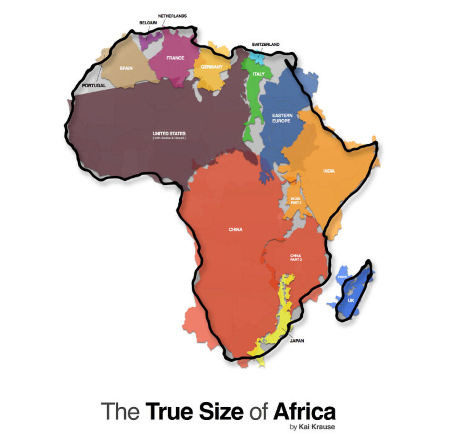
Source: Kai Krause
Answer
This map is titled "The True Size of Africa," and it demonstrates Africa's vast geographical area by overlaying various countries within its borders. It shows that Africa can accommodate the United States, China, India, Japan, and most of Europe, including France, Germany, Spain, Portugal, Italy, Switzerland, and the UK. The map highlights the often-misunderstood enormity of Africa compared to other major world regions, challenging common perceptions influenced by map projections that distort the continent's size.